Different traders see the market in different ways.
That’s why Flows.Trading offers a range of chart types, each designed to emphasize a specific aspect of price movement — from clarity to volatility to momentum.
Being able to switch chart types isn’t just about visual preference; it’s about adapting your analysis.
A line chart can simplify noisy price action, while a candlestick chart reveals rich intraday structure.
Choosing the right type helps you focus on what matters for your trading style.
Changing the Chart Type #
The current chart type is displayed in the Chart Type selector located in the top toolbar, next to the chart symbol field.

To change the chart type:
- Click the Chart Type icon (🕯️).
- A dropdown menu appears with all available chart styles.
- Select a chart type — the main price pane updates instantly.
💡 Tip: You can switch freely between chart types without losing your drawings or indicators.
Choosing the Right Chart Type #
There’s no single “best” chart type — the right one depends on your strategy and what you’re trying to see.
| Objective | Recommended Type | Why |
|---|---|---|
| Identify price patterns | Japanese Candlesticks | Shows full OHLC detail for structure analysis |
| Focus on overall trend | Line or Area | Simplifies noise, highlights direction |
| Spot trend momentum | Heikin Ashi | Smooths volatility, shows directional flow |
| Compare session volatility | OHLC / Hollow Candles | Emphasizes range and relative movement |
| Visualize discrete changes | Step Line | Highlights jump points and pauses |
💡 Pro Tip: Combine chart types across layouts — for example, view Candlesticks on your main chart and Heikin Ashi on a secondary chart to validate trend alignment.
Below is the list of chart types currently supported in Flows.Trading, with a short description and suggested use cases.
Japanese Candlesticks (default) #
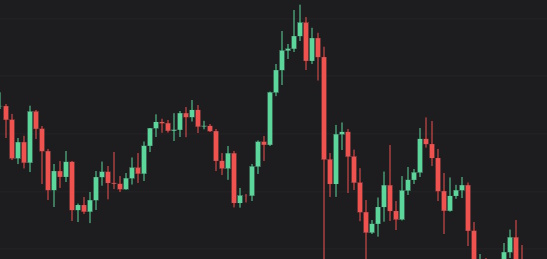
Description:
The most popular chart type among traders. Each candle shows four price points: Open, High, Low, and Close.
Candlestick colors represent whether price rose (bullish) or fell (bearish) during that period.
When to use:
Ideal for price action analysis and pattern recognition (e.g., engulfing, doji, hammer).
Use for both intraday and swing trading, when you need precise entry/exit visualization.
Hollow Candlesticks #

Description:
A visual variant of candlesticks. Hollow bodies represent periods that closed higher than the previous close, filled bodies represent lower closes.
When to use:
Great for momentum tracking — you can quickly spot continuation or reversal in trend strength.
Preferred by traders who like clean visuals with less color saturation.
Line Chart #

Description:
Displays only the closing price for each interval, connected by a line.
Removes intraperiod noise and highlights the overall price trajectory.
When to use:
For macro-level analysis and trend confirmation.
When you want a cleaner, less volatile view of market direction.
💡 Tip: Perfect for zoomed-out or higher timeframe analysis.
Line with Markers #

Description:
Same as a standard line chart, but adds small markers at each close to highlight each data point.
When to use:
When you want a precise view of each close while maintaining the simplicity of a line chart.
Useful for backtesting or manual trade journaling, where each close matters.
Step Line #

Description:
Shows a line that moves horizontally and vertically, connecting each close in a “step” pattern.
This makes it easier to visualize price changes between discrete intervals.
When to use:
When analyzing price stability or sudden jumps.
Helpful for assets with irregular trading activity or range-bound movement.
Area Chart #

Description:
A line chart with the area below the line filled with color.
Emphasizes the magnitude of price movement over time and provides a smoother, more visual impression of momentum.
When to use:
For visual summaries or when presenting data.
When you want a quick visual sense of direction and intensity.
OHLC Bars #
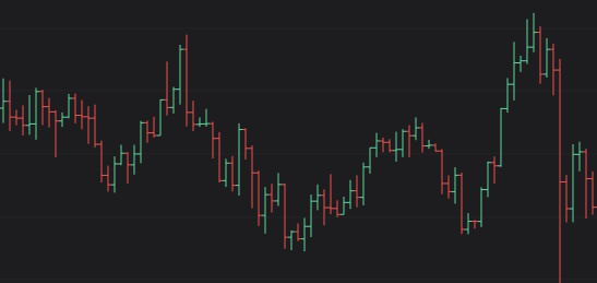
Description:
Each bar displays the same information as a candlestick (Open, High, Low, Close) but using vertical lines and ticks rather than filled bodies.
When to use:
For traders who prefer a minimalist, old-school representation.
Often favored in institutional or legacy charting systems.
OC / HL Bars #

Description:
Variants of the OHLC bar format that focus on different subsets of data:
OC: Open and Close only.
HL: High and Low only.
When to use:
For specific data analysis tasks, when you only want to see a certain aspect of market structure.
Useful in performance diagnostics or algorithmic comparisons.
Heikin Ashi #

Description:
A smoothed version of candlesticks. Each candle is calculated using the previous candle’s values, which filters noise and highlights trend direction.
When to use:
Ideal for identifying trend strength and reversals.
Great for visual clarity in trending markets, as small fluctuations are averaged out.
💡 Note: Heikin Ashi modifies the candle calculation — it’s best for analysis, not for exact entry/exit price tracking.


