Zooming helps you control how much of the market you see at once — from a broad overview to precise candle-by-candle detail.
🖱️ Using the Mouse Wheel #
Scroll up to zoom in (fewer candles, more detail).
Scroll down to zoom out (more history, less detail).
Hold CTRL + scroll to zoom centered around your cursor, so you can focus precisely on the area under your mouse.
💡 This is the most efficient way to analyze price structure — zoom in to inspect a swing, then zoom out to understand the broader trend.
Zoom Buttons #
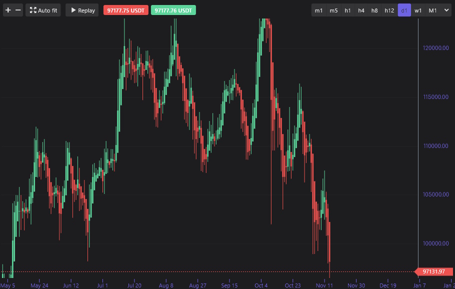
![]() If you prefer fixed steps, use the + and – buttons in the top-left toolbar to control zoom manually.
If you prefer fixed steps, use the + and – buttons in the top-left toolbar to control zoom manually.
Auto Fit #
When Auto Fit is enabled, the chart automatically adjusts its scale so all visible candles fit perfectly on screen.
You’ll never lose sight of price — even if you scroll or zoom extensively.
![]()
Use Auto Fit when:
You want to see the entire visible range clearly.
You’ve just zoomed or panned heavily and want to reset your view.
Manual Scaling #
When Auto Fit is turned off, you take control.
Click and drag the price scale (on the right edge of the chart) to stretch or compress the vertical axis.
This allows you to emphasize small price moves or zoom in on volatility.
💡 Manual scaling is ideal for fine-tuning perspective — for example, when comparing amplitude between swing highs and lows.


