MACD Indicator Mastery: Trading Strategies & Analysis
Table of Contents
Technical Analysis: A Foundation for Trading
For any trader hoping to succeed, a solid grasp of technical analysis is absolutely essential – it’s really like being a market detective! You’re carefully examining past price and volume data, searching for those tell-tale patterns that might suggest what the future holds. Traders leverage this knowledge to identify promising opportunities, knowing precisely when to jump into or out of trades, manage risk effectively, and ultimately increase their profits. It’s about making informed decisions in a constantly shifting landscape.
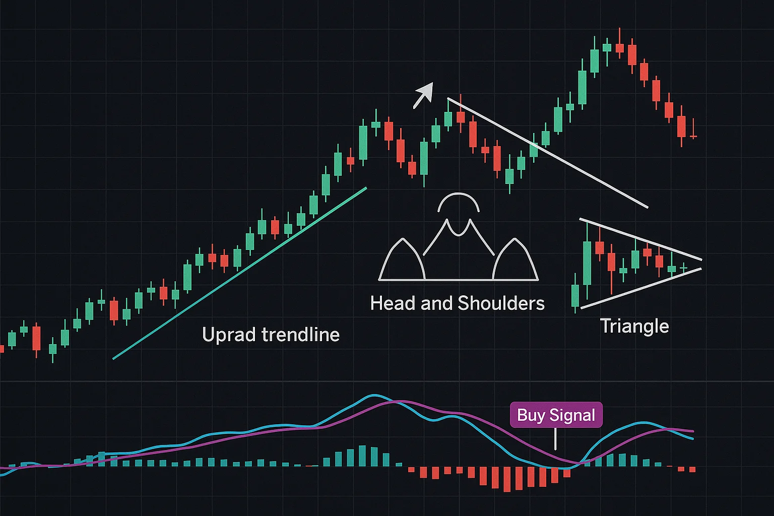
There’s a whole toolkit available within technical analysis too! Imagine trendlines acting as your guides, showing you the overall market direction. Then there are support and resistance levels – key areas where prices often find a floor or ceiling. Recognizable chart patterns, like the head and shoulders formation, offer additional clues, while indicators such as the MACD indicator give you valuable insights into momentum. Developing these skills can truly transform your trading game.
Why Use Technical Indicators?
Technical indicators are really useful for traders looking to fine-tune their strategies. Think of them as tools that dig into price and volume data, uncovering trends and patterns you might otherwise miss! For instance, the MACD indicator is great at spotting shifts in momentum – it can give you a heads-up about potentially good times to jump into or out of a trade. Ultimately, incorporating these insights can really boost your overall trading game. Want to learn more? Check out this guide.
Identifying Trends and Patterns
Smart trading really hinges on recognizing trends and patterns – it’s about noticing what’s happening! Shifts in volume or price often hint at larger movements down the road. Analyzing these sequences helps traders anticipate future shifts; you’ll frequently see formations like head-and-shoulders, triangles, and flags. The MACD indicator, when used with other tools, can unlock valuable insights into market momentum.
Reducing Emotional Bias in Trading Decisions
Consistent trading hinges on minimizing emotional bias – it’s a crucial element! Begin with honest self-awareness: acknowledging those familiar feelings like fear or greed is the first step. A solid, pre-defined trading plan, outlining clear entry and exit strategies, helps curb impulsive decisions. Take time to review your trades objectively; did emotions influence outcomes? Journaling your trade rationale and using stop-loss orders are helpful techniques. Data-driven analysis, rather than emotional reactions, boosts decision quality, and learning the MACD indicator can provide objective signals.
Demystifying the MACD Indicator
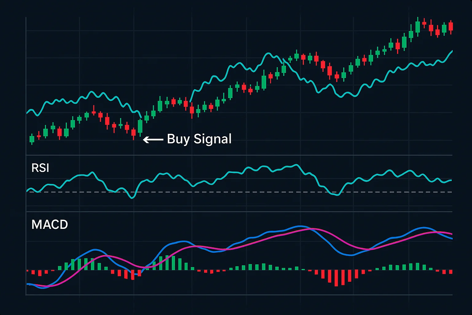
The MACD indicator is a popular tool for traders looking to identify potential buy and sell signals – it essentially visualizes how price changes over time. It does this by comparing two moving averages, which are like smoothed-out versions of the price history. You’ll notice three key components: the MACD line itself (showing the difference between those shorter and longer-term averages), a signal line that trails behind the MACD line, and finally, a histogram to help you see how they relate.
Understanding each part is really important for effective use. The direction of these lines gives you insight into momentum; a rising line often suggests prices are gaining strength, while a falling one might indicate weakness. Crossovers with the signal line can highlight potential trading opportunities, and that histogram helps gauge just how strong that momentum truly is – larger bars typically mean stronger trends. Mastering the MACD indicator can definitely be a valuable asset to your overall trading strategy.
What is the Moving Average Convergence Divergence (MACD)?
The Moving Average Convergence Divergence (MACD) is a really useful momentum indicator that technical analysts often turn to when trying to gauge price trends. At its core, it compares two exponential moving averages (EMAs) of an asset’s price—essentially highlighting potential shifts in trend direction and how strong those trends might be. You could think of it as noticing changes in speed; the MACD line itself displays that difference, and the signal line provides a shorter-term perspective for even more insight.
Understanding Momentum and Trend Direction
Ever noticed how a snowball gathers speed as it rolls down a hill? That’s similar to momentum in technical analysis! When buyers are increasingly interested, momentum heads upward; conversely, sellers gaining control creates downward momentum. Recognizing these changes can hint at potential trend shifts – handy for traders. Indicators like MACD and RSI offer insights into this force, helping anticipate price movements.
Calculating the MACD – The Key Components
Understanding the MACD indicator doesn’t have to be complicated! It really boils down to three key components. First, there’s the MACD line itself – it illustrates the relationship between two moving averages of price, essentially showing which trend might be gaining momentum. Next, the Signal Line smooths things out a bit, acting like a helpful filter. Finally, the Histogram gives you a quick visual cue about how far apart those lines are, making spotting trends much easier.
The MACD Line: Fast EMA vs. Slow EMA
The MACD indicator is quite handy for identifying changes in market trends—it leverages Exponential Moving Averages, or EMAs. These EMAs are more reactive than standard moving averages, quickly adjusting to recent price movements. Essentially, the MACD line results from subtracting a faster EMA (typically 12 periods) from a slower one (usually 26). An upward cross often signals a potential buying opportunity, while downward crosses might suggest considering selling.
The Signal Line: Smoothing the MACD Line
Want to refine your MACD analysis? Smoothing that line is a fantastic trick for reducing market clutter and highlighting key signals. A simple moving average—perhaps a 9- or 12-period SMA—can effectively filter out those rapid price fluctuations. This gives you a clearer picture of momentum, making it easier to identify potential trading opportunities. Plus, fewer false alarms often translate into more profitable trades using the MACD indicator!
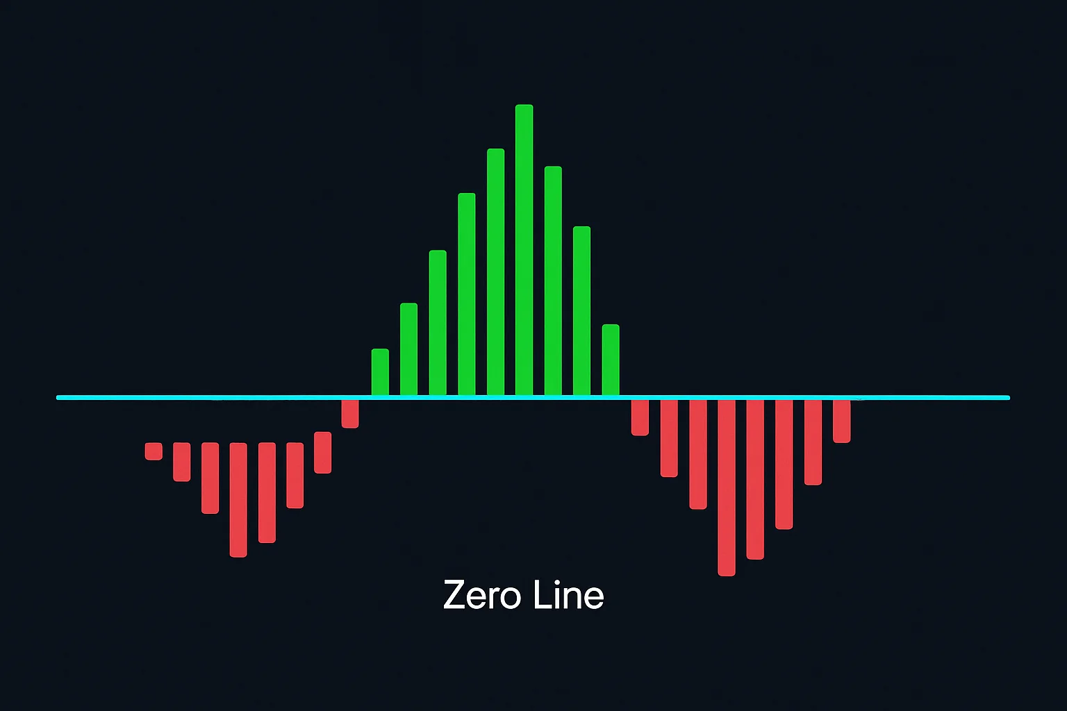
The Histogram: Visualizing the Difference
Histograms offer a truly fantastic way to visually compare datasets – it’s like seeing the story your data tells! They reveal how frequently information clusters within certain ranges, instantly highlighting patterns and distributions. Comparing histograms makes spotting differences in averages, spread, and shape remarkably easy; that’s crucial for smart analysis.
You can quickly identify shifts, outliers, and changes in density. This clear visual simplifies complex comparisons, helping traders rapidly assess asset performance.
Interpreting MACD Signals for Trading Opportunities
The Moving Average Convergence Divergence (MACD) indicator is a really useful tool to have in your arsenal when looking for potential trading opportunities. Getting familiar with its signals – crossovers, divergences, and centerline crossings – can significantly improve how you analyze the market. For instance, a bullish crossover, where the MACD line moves above the signal line, often suggests upward momentum is building. Conversely, a bearish crossover might be a sign that downward pressure is increasing. You’ll also want to watch for divergences; these occur when price action reaches new highs or lows, but the MACD doesn’t quite follow along – they can frequently hint at trend reversals on the horizon.
It’s important to remember though, that MACD signals aren’t foolproof! Always use risk management techniques like stop-loss orders and confirm these signals with other indicators or by simply observing price action. Curious about a deeper dive into how the MACD is actually calculated and interpreted? You can find more details here: https://www.investopedia.com/terms/m/macd.asp. Consistent practice and backtesting will really help you master it.
Crossovers: Bullish & Bearish Signals
Crossovers are a really useful tool in technical analysis, often hinting at changes in market direction. Think of it this way: a bullish crossover, where a shorter moving average climbs above a longer one, can suggest upward momentum is building. On the flip side, a bearish crossover, with that short-term average dipping below the long-term, might signal a potential downturn. Traders often look to indicators like MACD for these signals.
It’s worth remembering though – relying solely on crossovers isn’t always reliable! It’s best to confirm them using other technical analysis techniques and observing price action before making any decisions. Want to dive deeper? https://www.investopedia.com/terms/m/movingaveragecrossover.asp has a great explanation.
MACD Line Crossing Above Signal Line (Buy)
The MACD indicator offers a neat way to see how two moving averages relate, often highlighting shifts in momentum. You’ll find the MACD line showing their difference, while the Signal Line provides a smoother view. A crossover above that Signal Line? It can suggest prices are on the rise – potentially a buying opportunity! Of course, technical analysis isn’t perfect; it’s always wise to double-check with other tools. Want to dive deeper into MACD? https://www.investopedia.com/terms/m/macd.asp has a great explanation.
MACD Line Crossing Below Signal Line (Sell)
Spotting the MACD line falling below the Signal Line? It often suggests a bearish trend – essentially, momentum’s fading for an asset’s price. Many traders see this MACD indicator as a cue to perhaps sell or tweak their stop-loss strategies. Just remember to double-check with other tools like volume analysis; no signal is foolproof, and smart risk management always matters.
Zero-Line Crossovers: Potential Trend Reversals
Spotting zero-line crossovers on indicators like the MACD indicator can be an interesting clue when looking for potential trend changes. For example, a bullish crossover – where the MACD line climbs above zero – could mean selling isn’t as strong and an uptrend might be coming. Conversely, if it dips below zero, that bearish crossover could suggest buying momentum is fading, possibly pointing to a downtrend. Keep in mind though, these are just signals; always double-check with other technical analysis tools and look at volume alongside price.
MACD Line Crossing Above Zero Line (Bullish)
Spotting the MACD indicator line crossing above zero? Many see that as a bullish signal – kind of like a burst of speed! It hints that recent price gains are stronger than longer-term trends, suggesting positive momentum is building. Traders often consider this crossover when looking for potential buying opportunities, but it’s always wise to combine it with other analysis tools.
MACD Line Crossing Below Zero Line (Bearish)
Spotting the MACD indicator line fall below zero? That often hints at a bearish signal – essentially, a shorter-term trend temporarily giving way to a longer one. Many traders see this crossover as a chance to sell or explore short positions. While it’s not a guaranteed predictor, it can be quite helpful for identifying potential shifts in trends and making smarter trading decisions.
Divergences: Identifying Weaknesses in Trends
Spotting divergences can really shed light on how markets are moving, particularly when you’re watching price action with tools like the MACD indicator. A bullish divergence pops up when prices dip to lower lows, but an indicator shows a bit of strength – it might mean selling isn’t as intense. Conversely, a bearish divergence signals new highs in price alongside a weakening indicator; perhaps upward momentum is losing steam. Keep in mind, divergences aren’t crystal balls! They offer a potential heads-up, so always confirm with other analysis and the broader market context. Ready to sharpen your trading skills? Check out our resources for more MACD indicator insights!
Bullish Divergence – Price Makes Lower Lows, MACD Makes Higher Lows
Spotting a bullish divergence can be a clue about possible trend shifts. Think of it this way: the price might hit new lows, indicating fading downward momentum, but the MACD shows rising lows—a sign of increasing upward strength. For example, you could notice a stock declining, yet its MACD suggests improvement. It’s not an instant buy signal, though; rather, potential evidence that selling pressure is lessening and an uptrend might emerge. Always double-check with other analysis tools to be sure.
Bearish Divergence – Price Makes Higher Highs, MACD Makes Lower Highs
Seeing price action hit new highs while the MACD indicator shows lower highs? That’s a telltale sign of bearish divergence – momentum’s quietly fading, even as prices climb! Think of it like a stock soaring, but its MACD showing decreasing strength; it could signal an upcoming shift. It’s just one piece of the puzzle though, so always confirm with other tools before acting. Using the MACD indicator to spot this divergence can help traders anticipate potential uptrend weakness and adjust their approach.
Combining MACD with Other Indicators & Chart Patterns
The MACD indicator is helpful on its own, but it truly becomes powerful when used with other technical analysis methods. It’s like this: solely relying on MACD signals can sometimes lead you astray, so confirmation from other indicators and chart patterns is really important for making informed trading decisions. For instance, pairing the MACD with the Relative Strength Index (RSI) helps spot overbought or oversold situations that align with potential MACD crossovers – boosting signal reliability considerably.
It’s also a smart move to consider familiar chart patterns like head and shoulders or triangles alongside your MACD analysis. A bullish breakout from a triangle, confirmed by a MACD crossover, creates a much stronger buy signal than either one would on its own. Plus, using Fibonacci retracement levels with the MACD can help pinpoint ideal entry points. Ultimately, this synergy between tools improves accuracy; it’s all about building a well-rounded trading strategy.
Confirmation with Trendlines
Trendlines are incredibly useful – picture them as guide rails helping you understand price movements. Confirming these lines with other tools like the Relative Strength Index (RSI) can give your trading a real confidence boost. Don’t forget to watch for MACD indicator divergence; it’s worth noting that a new high in price without an RSI peak might suggest a trendline break is coming. For example, if a rising trendline gets tested and the RSI shows oversold conditions, you could see support and a bounce back. On the flip side, a falling trendline test with an overbought RSI often points to continued downward pressure.
Synergy with Relative Strength Index (RSI)
Using the Relative Strength Index (RSI) alongside other technical analysis tools can significantly improve your trading accuracy—it’s like getting a second opinion! When RSI confirms signals from moving averages or trendlines, you’ve got something solid. For example, a 50-day moving average crossover paired with an oversold RSI reading could suggest a buying opportunity.
RSI also helps avoid false alarms. If MACD indicates a strong uptrend, check that the RSI remains within a reasonable range—around 30 to 70—for extra confirmation. This layered approach minimizes risk and boosts your chances of successful trades by working together.
Identifying Overbought/Oversold Conditions
Knowing when an asset might be overbought or oversold can really help manage your risk! The RSI indicator is a popular tool for spotting these moments – generally, values above 70 suggest it’s getting overbought, and readings below 30 hint at being potentially oversold. Learn more about the RSI indicator. Remember though, these aren’t always clear signals to trade; confirming them with other indicators is a smart move.
Integrating with Fibonacci Retracement Levels
Practical Trading Strategies Using the MACD
The MACD indicator is a really useful tool for traders trying to understand market momentum and find potential opportunities. A common strategy involves looking out for crossovers – when the MACD line crosses above the signal line, it often hints at an upward trend; that could be a good time to think about buying! Conversely, if the MACD line dips below the signal line, it might suggest weakening sentiment and perhaps a sell signal. To get even more confidence in these signals, many traders like to confirm them with other technical analysis tools, such as checking trading volume.
Remember that risk management is key. Always use stop-loss orders to protect your capital. You can also check out the MACD histogram, which visually shows the difference between those two lines – wider bars often mean stronger momentum. If you’re just starting, it’s best to begin with simple crossover strategies and gradually build your understanding of the MACD indicator.
Trend Following Strategy
Trend following is a straightforward trading strategy focused on capitalizing on existing market trends – think of it as jumping on board when you see assets consistently rising or falling. The beauty of it lies in its simplicity; the rules are generally easy to understand, primarily relying on price movements to gauge trend strength. However, no strategy’s perfect! Unexpected whipsaws can throw you off course, so disciplined risk management and a healthy dose of patience—waiting for confirmations like signals from the MACD indicator—are key to success.
Utilizing Crossovers for Entry and Exit Points
Technical indicators, like the Relative Strength Index (RSI), frequently display crossovers that can point to opportune moments for buying or selling. A bullish crossover – when a shorter moving average surpasses a longer one– often suggests increasing upward momentum. Conversely, bearish crossovers might hint at a potential downturn. It’s always wise to confirm these signals; combining them with tools like the MACD indicator strengthens their reliability. Seeing an RSI bullish crossover alongside rising volume, for example, provides greater confidence.
Range-Bound Trading Strategy
Range-bound trading can be surprisingly effective, especially when markets aren’t going anywhere fast – picture a ball bouncing back and forth! Spotting these ranges really comes down to recognizing those consistent support and resistance levels where prices tend to reverse. Opportunities pop up as the price tests those boundaries; it’s often smart to buy near support and sell at resistance. Effective risk management is key, so definitely use stop-loss orders just outside the range for protection. A clear bounce before entering a trade and setting profit targets within that range are helpful too. Consistent monitoring will allow you to adjust your approach as needed.
Combining MACD with Oscillators
Want to refine your trading? Combining MACD indicator analysis and oscillators, like the RSI, can really help! The MACD shows you shifts in momentum, while oscillators let you know when an asset might be overbought or oversold – essentially confirming trends. For example, a bullish crossover alongside an oversold RSI often points to a good buying opportunity. Keep an eye out for divergences too; if the MACD weakens even as prices climb, it’s worth being cautious.
Swing Trading with Divergences
Ever noticed when the price seems to be heading one way, but something else suggests a shift? That’s where divergences come in – they can really boost your swing trading. Think of it like this: prices dropping while momentum builds; that’s a bullish divergence hinting at less selling pressure. Conversely, fading buying interest alongside rising prices signals a bearish divergence. Recognizing these patterns might just point to upcoming trend reversals!
To be sure, always confirm divergences with other tools – things like support/resistance levels or volume analysis can really refine your entry and exit points. Why not start practicing today? It’s a great way to hone your skills and spot those valuable signals.
Backtesting & Risk Management – Essential Considerations
Developing a winning trading strategy hinges on two crucial elements: thorough backtesting and solid risk management. Backtesting allows you to see how your approach might have fared historically – it’s a great way to spot potential strengths, but be careful! It’s easy to get caught up in optimizing for past data alone, or overlooking the impact of transaction costs. Of course, past performance isn’t a guarantee of what’s to come; markets are always shifting.
Equally important is risk management – think setting clear loss limits and utilizing tools like stop-loss orders. Really understanding potential drawdowns and volatility can make all the difference. When you combine rigorous backtesting with disciplined risk controls, you significantly boost your odds of long-term success and help protect yourself from those potentially large losses that come with dynamic markets.
The Importance of Historical Data Analysis
Successful trading often hinges on a solid grasp of historical data analysis. Really, looking back at past market trends can reveal recurring patterns – it’s like gaining valuable experience! This insight helps traders anticipate what might happen next, moving beyond guesswork and toward more strategic decisions. Understanding historical performance is truly foundational for building robust trading plans.
Plus, analyzing this data significantly reduces risk. By studying things like past volatility and corrections, you can better prepare for tougher market conditions. This proactive approach strengthens your portfolio and boosts the likelihood of consistent profits.
Testing Different Parameter Settings (Fast/Slow Periods)
Finding the sweet spot with the Relative Strength Index (RSI) involves tweaking those settings—fast and slow periods, for example. Shorter periods can give you quick signals in volatile markets, while longer ones provide a clearer picture when trends are strong. It’s really important to test across different assets too! Ultimately, the ideal RSI parameters will shift based on what you’re trading, so keep an eye on performance and adjust as needed.
Implementing Stop-Loss Orders
Trading involves inherent risks, doesn’t it? That’s why stop-loss orders are so important – they act like a safety net, automatically closing a trade if things don’t go as planned. Setting one up is pretty straightforward; you pick a price where you’re okay with limiting your losses. Most trading platforms offer options like market stops or trailing stops, which cleverly adjust as prices move upwards! Just remember to factor in your risk tolerance and how the asset typically behaves when choosing your stop-loss level, and be sure to check them periodically.
Protecting Capital and Limiting Losses
Sustained success in trading really hinges on protecting your capital. Smart risk management techniques, such as stop-loss orders and thoughtful position sizing, are essential for that. It’s also helpful to stick with a strategy—avoiding emotional decisions is a big win! Diversifying your portfolio and periodically reviewing your risk tolerance can help you adapt and safeguard your gains.
Position Sizing Based on Risk Tolerance
Managing risk effectively is crucial for protecting your capital – that’s where position sizing comes in! Think about how much you’re comfortable potentially losing on any single trade; a conservative approach often suggests using 1-2% of your account, while others might go with 3-5%. More experienced traders might push it to 5-10%, but that requires serious discipline. To really refine your MACD indicator trading strategy, start small, carefully analyze the outcomes, and make adjustments as you learn.
Leveraging Flows.trading for MACD Signal Tracking & Analysis
Flows.trading is built to streamline MACD indicator tracking, making it easier than ever to identify potential trading opportunities. It’s really quite intuitive – you can customize your view from daily charts all the way down to intraday minutes, allowing for precise signal detection that aligns perfectly with your strategy. The dashboard provides a clear look at everything: the MACD line itself, the signal line, and even the histogram, all presented in an easy-to-understand format.
Want to stay on top of things? Flows.trading’s alert system sends instant notifications when MACD signals pop up – crossovers or divergences, for example. This proactive approach lets you react quickly to changing market conditions. And because understanding past performance is key, the platform also offers historical data analysis tools so you can backtest your strategies and gain valuable insights.
Automated Alerts and Notifications
Automated alerts and notifications really boost your trading efficiency, don’t they? It’s fantastic to get real-time market updates delivered directly – say goodbye to those frustrating delays and hello to fewer missed opportunities! Having timely information at your fingertips lets you react much faster to changing conditions.
You can tailor these features to respond to specific events, like prices reaching certain levels or signals from indicators; the MACD indicator is a great example. This proactive approach means less constant monitoring and supports smarter trading decisions overall.
Visualizing MACD Performance Over Time
Seeing how the MACD indicator looks on a chart is really important for smart trading. Essentially, the MACD line shows you what’s happening with moving averages – it can often give clues about shifts in trends. A crossover—when that MACD line crosses above or below the signal line—is frequently seen as a possible buy or sell opportunity. And then there’s the histogram, which displays the difference; bigger bars usually mean stronger momentum. By paying attention to these visual signals, you can get a better handle on market trends and refine your strategies. Want to learn more? Check out our resources to master this powerful tool!