5 Technical Indicators for Beginners: A Simple Guide
Table of Contents
What is Technical Analysis?
Want to gain a real edge in the market? Technical analysis provides traders and investors with a fantastic toolkit for evaluating securities. It’s all about looking at what’s happened – specifically, historical price and volume data – to try and predict where things might go next. Rather than digging deep into a company’s financials (that’s fundamental analysis!), technical analysts focus on charts and patterns, searching for clues about investor sentiment and shifts in supply and demand.
There’s a whole range of helpful tools available within technical analysis, including trend lines, support & resistance levels, and various technical indicators like Moving Averages or the Relative Strength Index (RSI). Consider these indicators as visual aids that can confirm potential trading signals. Mastering these techniques could be incredibly valuable – it’s about finding those opportune moments to buy low and sell high!
Why Use Technical Indicators?
Wanting to get a better handle on market trends? Technical indicators can be incredibly helpful for traders! They take complex price data and turn it into easy-to-understand signals, helping you spot shifts in momentum or potential reversals. It’s all about making more objective decisions – less emotion, more data. These tools complement other strategies like fundamental analysis and chart patterns too. While no indicator is foolproof, they offer a valuable, data-driven perspective when weighing risk versus reward. Really mastering them means understanding how different indicators work together.
Choosing the Right Indicators for You
Finding the right technical indicators really can boost your trading success. Honestly, it’s usually better to stick with something simple you understand well than a complex tool that leaves you scratching your head. Think about what kind of trader you are – do you prefer quick day trades or longer-term investments? It’s always smart to test any potential indicator using historical data too. Keep in mind, no single technical indicator is perfect; combining a few often provides a clearer view of market trends. Tools like Moving Averages and RSI can be great starting points. Ready to begin learning?

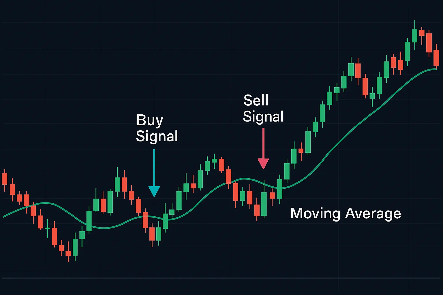
Moving Average (MA) - Smoothing Price Data
The Moving Average (MA) is a really useful tool for technical analysis – it’s designed to smooth out those often-choppy price charts and filter out some of the daily market noise. Think of it as taking a longer view; instead of focusing on each individual day, you calculate an average over a specific timeframe—maybe 10 days or even 50. This helps reveal underlying trends more clearly. You’ll find different types too, such as Simple Moving Averages (SMA) and Exponential Moving Averages (EMA), with the latter emphasizing recent price action a bit more.
A major benefit of using a Moving Average is its ability to showcase those broader trends that can easily get obscured by short-term fluctuations. Many traders actually use them to generate buy or sell signals, often watching for when the current price crosses above or below the moving average line.
What is a Moving Average?
Ever feel like financial markets are just too noisy? A moving average can help! Think of it as smoothing out uneven ground – it transforms price data into a flowing line, making those short-term fluctuations fade away. This lets you see the bigger picture and spot potential trends more easily. Essentially, it reduces that noise on your charts by averaging prices over a specific period, like 50 days, giving traders a clearer view of whether things are trending up, down, or staying put.
Simple vs. Exponential Moving Averages
Simple Moving Averages (SMA) offer a way to smooth out price data, helping you spot trends—though they can sometimes lag behind what’s happening right now. Exponential Moving Averages (EMA), on the other hand, give more weight to recent prices, making them quite responsive and useful for catching those quick shifts. Understanding these differences is key in technical analysis!
SMAs are great for confirming trends you already see, while EMAs excel at identifying momentum changes. Both serve as valuable technical indicators, so choosing between an SMA and EMA really depends on your trading style and the timeframe you’re looking at.
How is it Calculated?
The Relative Strength Index (RSI) is a really handy tool for traders. It helps you quickly see if an asset’s price has jumped too far, too fast! The calculation looks at average gains and losses—typically over 14 days—to give us this useful technical indicator. You can think of it like checking to see if a pendulum has swung too much; the RSI lets us know whether something might be overbought or oversold.
Interpreting the Moving Average
Figuring out moving average charts is simpler than it looks – really just about observing the slope and those interesting crossovers! A line trending upwards often suggests things are looking positive, while a downward trend could indicate some potential challenges. Those moments when shorter averages cross longer ones? They can offer clues for buying or selling—like recognizing familiar patterns from history. Keep in mind though, these are lagging indicators, showing what’s already occurred.
Don’t rely solely on moving averages; they don’t predict the future and can occasionally be misleading. Instead, consider them alongside other technical analysis tools to get a better grasp of market trends and manage your risk wisely.
Example Use Case: Identifying Trend Direction
Understanding trend direction really matters when using pattern recognition – it’s what makes it work! Take a double bottom chart pattern, for example; it often suggests prices are about to shift from falling to rising, kind of like the market recovering. Traders usually look for increased volume or a breakout before jumping in. Likewise, a bearish engulfing pattern could hint that an uptrend is nearing its end. To really boost your analysis and manage risk better, consider pairing these patterns with technical indicators like Moving Averages.
Limitations of Moving Averages
Moving averages are a popular technical indicator, but they do have their drawbacks. One thing to keep in mind is that they lag – essentially, they reflect past prices, which can mean you’re reacting a bit late to current trends. It’s like checking your rearview mirror while driving! To avoid missing out on opportunities, it’s best not to rely solely on moving averages. Plus, these indicators can sometimes generate false signals when the market is calm. For smarter trading decisions, consider combining them with other analysis techniques. Check out our guide to technical indicators and level up your strategy!
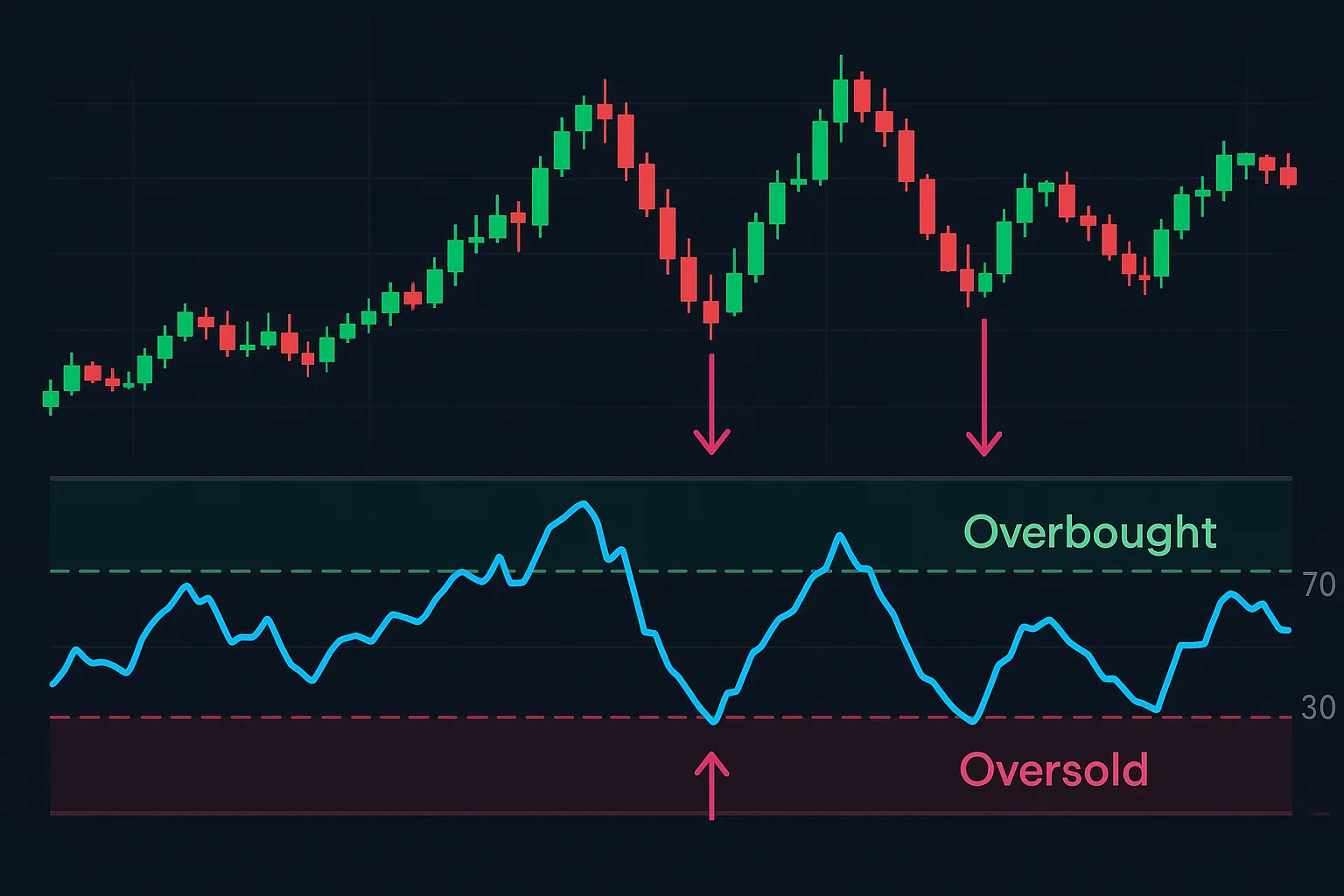
Relative Strength Index (RSI) – Measuring Momentum
The Relative Strength Index (RSI) is a fantastic tool for traders, giving you insight into an asset’s price momentum – how quickly and powerfully the price is changing. It’s kind of like checking how fast a car is speeding up; a rising RSI often means bullish energy is building, while a falling one might suggest things are slowing down or even turning bearish. This indicator can be really useful for spotting potential shifts in trends.
RSI figures this out by comparing average gains and losses over a specific period, typically 14 days. Usually, readings above 70 indicate an asset could be overbought – maybe due for a correction – while values below 30 often signal it’s oversold and might bounce back. Really understanding RSI can significantly improve your trading strategy.
What is the RSI?
The Relative Strength Index (RSI) is a popular technical indicator that many traders use to understand market momentum – essentially, how quickly and in what direction prices are moving. Imagine it as an oscillator swinging between 0 and 100; it analyzes recent price changes to help determine if an asset is overbought or oversold, which could suggest a reversal is coming. It’s a handy tool for spotting when things might have moved too far, too fast! You can find more details about the RSI here.
How is it Calculated?
The Relative Strength Index, or RSI, is a handy tool for spotting potential shifts in market trends—essentially, figuring out if an asset’s price has become overly enthusiastic (overbought) or perhaps unfairly neglected (oversold). It works by averaging gains and losses, typically over 14 days, to produce a score between zero and one hundred. You could think of it as checking if a stock’s popularity has gone too far! The formula itself involves calculating Relative Strength—average gain divided by average loss—and then plugging that into the RSI equation. Want to dive deeper into the calculation? Investopedia offers a great explanation here.
Understanding Overbought and Oversold Levels
Technical analysis often looks for overbought and oversold levels – essentially, has an asset’s price moved too far, too fast? An overbought signal might suggest a pullback is coming, while oversold conditions could indicate a potential bounce. The Relative Strength Index (RSI) is one indicator that frequently flags these situations. Remember though, they aren’t foolproof; consider them as potential reversals needing further confirmation. Investopedia offers a great explanation.
Interpreting RSI Signals
Figuring out RSI signals is all about spotting when an asset might be stretched too far – like a rubber band! Generally, an RSI above 70 suggests it could be overbought and due for a price correction. Conversely, values dipping below 30 might indicate an oversold situation, potentially leading to a rebound. But remember, these aren’t the whole story. Keep an eye out for divergence – when price action and the RSI don’t quite align; that can reveal some interesting patterns. Ultimately, RSI shines brightest when you use it alongside other technical indicators as part of your trading plan.
Example Use Case: Spotting Potential Reversals
For traders, recognizing market reversals is crucial, and technical indicators can really help with that! Take the Relative Strength Index (RSI), for example – when it pushes above 70 (that’s overbought!) and begins to decline, a trend reversal could be on the horizon. Similarly, a bearish MACD crossover might signal a shift towards a downtrend. Keep an eye on volume too; decreasing buying power during an uptrend often suggests weakening momentum and a potential change is brewing. Combining these signals gives you a much clearer picture.
Limitations of the RSI
The Relative Strength Index (RSI) is a really useful tool for traders, but remember, no indicator is foolproof. It’s kind of like getting weather advice – sometimes it’s spot-on, and other times, the sun shines when you expected rain! Solely relying on the RSI, particularly during powerful market trends, could mean missing out on some great opportunities. To help avoid those situations, always look at the broader context and tweak settings depending on what you’re trading. Combining it with price action and volume can build a much stronger strategy. Want to learn more? Check out our guide on essential technical indicators – it’s a fantastic way to level up your skills!
MACD - Identifying Trend Changes & Strength
The MACD indicator is really helpful for spotting potential shifts in market trends and gauging their strength—it essentially shows you how two moving averages of price data relate. You can often see a bullish signal when the MACD line crosses above the signal line, suggesting upward momentum is gaining traction. Conversely, if that MACD line dips below the signal line, it might be an early warning sign of a possible downtrend. Interestingly, divergences—where prices make new highs or lows but the MACD doesn’t quite follow along—can sometimes foreshadow reversals too.
Beyond just identifying changes, the MACD histogram gives you clues about how strong those trends are. A widening histogram suggests momentum is picking up speed, whether it’s pushing prices higher or lower, while a narrowing one hints at weakening momentum. Of course, no indicator is foolproof; combining the MACD with other technical analysis tools will generally lead to more well-informed trading decisions.
What is the MACD?
The MACD indicator is a popular tool for technical analysis – it’s essentially about comparing moving averages to see where momentum might be shifting! Short for Moving Average Convergence Divergence, the MACD can give you clues about potential buying or selling opportunities. It breaks down into three main components: the MACD line itself, a signal line, and a histogram that really helps visualize things. All these pieces work together to offer valuable insights into what’s happening in the market.
How is it Calculated?
The Relative Strength Index (RSI) is a handy tool for understanding momentum – it looks at average gains and losses, typically over a 14-day period. You can picture it as this: when prices climb consistently faster than they decline, the RSI suggests potential strength in the market. The formula itself calculates RSI as 100 minus [100 / (1 + Average Gain / Average Loss)], providing a technical indicator that helps identify possible overbought or oversold conditions.
The Signal Line and Histogram
Want to gain a real edge in trading? The MACD indicator is fantastic for that! It cleverly uses a Signal Line – think of it as a quick snapshot of recent activity – and a Histogram. Spotting crossovers between these can hint at shifting momentum, so you can time your trades better. Plus, the Histogram visually shows the difference; rising bars feel good (bullish!), while falling ones suggest caution (bearish!). Watch for divergences too—they might just signal an exciting trend reversal!
Interpreting MACD Signals
Want to level up your technical analysis? Learning about MACD signals can really help! A bullish signal – picture it as a green light – pops up when the MACD line crosses above the signal line, hinting at increasing upward momentum. Conversely, a bearish signal, like a yellow caution sign, appears when the MACD line dips below; this could suggest downward pressure. It’s always smart to confirm these signals with other indicators for better accuracy.
Many traders use MACD to find good entry and exit points. The histogram gives you even more information – rising positive values mean bullish trends are getting stronger, while shrinking negative values might indicate weakening bearish trends. Just remember, MACD is a lagging indicator, so it reflects what’s already happened with price.
Example Use Case: Confirming Trend Direction
Spotting a trend is great, but confirming its direction is vital for smart risk management. Before you invest, our tool can help validate signals with indicators like Moving Averages or RSI – it’s like getting a second opinion! This confirmation builds confidence and reduces the chance of acting on false alarms.
A proactive approach really pays off; consider validating Bitcoin’s uptrend using MACD for extra assurance. Trend confirmation helps traders avoid those tricky counter-trend moves, which can ultimately boost your profitability.
Limitations of the MACD
The MACD indicator is a popular tool for traders, but it’s good to know it has limitations. Imagine it like this – sometimes, especially in quiet markets, it can send you down the wrong path. Since it responds after prices move, you could potentially miss out on prime buying or selling moments. Don’t rely solely on MACD!
Keep in mind that technical indicators don’t factor in those bigger picture influences affecting an asset’s value. And fiddling with the settings too much? That can lead to trouble. It’s always best to pair MACD with other analysis methods and solid risk management strategies. Want to learn more? Check out our guide on essential technical indicators!
Fibonacci Retracement – Finding Support & Resistance Levels
Fibonacci Retracement is a really popular tool that traders use in technical analysis – it’s all about finding potential support and resistance areas within financial markets. The idea behind it revolves around those familiar Fibonacci ratios, like 23.6%, 38.2%, and especially the famous 61.8%. These suggest prices often bounce back a bit before continuing their original direction; you could picture it like a rubber band stretching out and then snapping back.
Essentially, traders use Fibonacci Retracements to try and predict where price reversals might happen, letting them place buy or sell orders strategically. Really getting a feel for how prices react at these levels is crucial for successful trading, and many folks combine it with other technical indicators just to be sure.
What are Fibonacci Retracements?
Technical analysts often turn to Fibonacci retracements when searching for potential support and resistance zones on price charts. Derived from the famous Fibonacci sequence, key levels—like 23.6%, 38.2%, and 61.8%—show up as horizontal lines. You can consider these as places where prices might pause or even reverse direction after a significant move.
Essentially, Fibonacci retracements help traders anticipate those pullbacks or rallies. Grasping these levels provides valuable insights for finding potential entry and exit points, though it’s always wise to combine them with other technical indicators.
How are they Drawn?
Candlestick charts provide a really useful visual look at how prices move. Each ‘candle’ essentially captures a moment in time, displaying the highest, lowest, opening, and closing prices for a specific period. A green body shows that the price increased, while red indicates a decrease – pretty straightforward! The wicks extending from the body give you an idea of the extreme highs and lows reached. Learning to read these details is key for traders wanting to understand market sentiment and spot potential trends; it’s a core element of technical indicators in technical analysis.
Key Fibonacci Levels (23.6%, 38.2%, 50%, 61.8%, 78.6%)
Technical analysis relies heavily on Fibonacci retracement levels—they’re really helpful for spotting potential support and resistance! These percentages, like 23.6%, 50%, and 61.8%, hint at areas where prices might bounce back after a significant shift. Interestingly, these ratios appear frequently in nature. Many traders use Fibonacci retracements to anticipate buying or selling opportunities during pullbacks.
Interpreting Fibonacci Levels
Many traders rely on Fibonacci retracement levels—a popular technical indicator—to get an idea of where prices could bounce back or meet resistance. Those key percentages you see, like 23.6%, 38.2%, and 61.8%, often mark potential pullback points; essentially places where a trend could take a breather. It’s always smart to pair Fibonacci retracement with other tools—moving averages are a good example—to strengthen your signals. When a Fibonacci level lines up with an existing support zone, that’s a really encouraging sign!
Example Use Case: Identifying Potential Entry Points
Spotting good entry points is absolutely vital for successful trading – think of it like finding the ideal spot to step into a flowing stream! You really want to choose carefully. For example, when two Moving Averages cross, that can often signal a buying opportunity. Or, if the RSI dips below 30, it might suggest an asset is oversold and poised for a rebound. Seeing volume spikes alongside price increases? That just strengthens those signals – all important technical indicators to watch!
Limitations of Fibonacci Retracements
Fibonacci retracements are a popular tool in technical analysis, but it’s important to remember they aren’t foolproof. It’s tempting to see them as simple buy or sell signals, however, think of them more like helpful guides when used alongside other methods. Picking those initial swing highs and lows can be tricky – it’s often subjective! Remember, Fibonacci retracements don’t promise future price action.
Think of these levels as potential areas where prices might find support or resistance, rather than guaranteed outcomes. Ultimately, broader market trends usually have a bigger impact than Fibonacci projections do. For a well-rounded trading strategy, always incorporate risk management and other technical indicators. Want to learn more? Explore our guide to technical indicators!
Volume – Gauging Market Participation
Figuring out how many people are actively involved in a market – that’s market participation – is really important for any trader wanting to make smart moves. It’s kind of like checking out the buzz at an event; you want to see how enthusiastic everyone is! Things like sudden jumps in trading volume can give you some great hints, often showing strong feelings behind big price shifts. But if prices are bouncing around with low volume, that might mean things aren’t stable or even suggest something’s being manipulated.
Lots of things affect participation levels – the general mood of the market, major news, and what big institutions are doing all play a part. By keeping an eye on volume alongside price changes, you can get a better sense of trends, spot potential turnarounds, and manage your risk more effectively. Ignoring volume? That could easily lead to misreading signals and making choices you’ll regret.
What is Trading Volume?
Ever wonder what’s really happening with an asset’s popularity? Trading volume gives you a good clue! It shows the total number of shares or contracts bought and sold over a specific time, typically daily—essentially, how much action there is. Think of it like this: if something sells out quickly at your favorite store, that’s high demand, right? Volume works similarly; while not a crystal ball on its own, volume adds important context when you’re looking at price movements and other market signals.
How to Interpret Volume Spikes
Knowing how to interpret volume spikes is a real advantage for traders! These sudden bursts of activity often pop up around significant events – maybe a major news announcement or finally breaking through a resistance level. It’s worth taking a moment to consider why the spike happened; is it driven by excitement, or something more cautious? Confirming signals requires careful thought—while high volume can indicate strong belief, always look at other technical indicators too. Spotting these details can really help fine-tune your strategy and potentially boost your results.
High Volume and Trend Confirmation
Spotting a potential opportunity from high volume signals? It’s smart to confirm the trend first! Imagine seeing a ripple – is it just one wave or something bigger? Tools like moving averages can help you identify established patterns and look for spikes that align with existing momentum, strengthening signal reliability. And don’t forget confluences—when multiple indicators agree; combining high volume data with confirmed trends really boosts your confidence.
Example Use Case: Validating Breakouts
Ever wonder how to really confirm a stock market breakout? Let’s say a price climbs above its 50-day moving average – that’s usually encouraging! But here’s the key: our system looks at trading volume too. Is it significantly higher than usual? A big jump suggests genuine buying interest, validating the move. Conversely, low volume could signal something less reliable, like market manipulation or just a lack of real conviction.
Limitations of Relying Solely on Volume
Just focusing on trading volume alone? That’s not always the best strategy! While high volume often signals activity, it doesn’t automatically mean a trend is healthy – false breakouts can happen, you know. Sometimes, increased volume actually precedes price reversals, which can surprise traders. Really, looking at the bigger picture—market context and those underlying fundamentals—is crucial. Think about short squeezes; they demonstrate how volume can temporarily push prices up without creating lasting gains. So, combine your volume analysis with other indicators for smarter trading decisions.
Putting It All Together & Next Steps
So, you’ve taken a look at some technical indicators – fantastic! The real magic happens when you start seeing how Moving Averages, RSI, MACD, Fibonacci levels, and Volume all play together. It’s like piecing together a puzzle to get a clearer view of the market. Remember though, no indicator is perfect; it’s about understanding them within the broader context.
Consistent practice really does make a difference! Begin by testing these tools on historical charts and then move into simulated trades. A great way to learn is to keep a trading journal, noting which indicators influenced your decisions. Experiment with different combinations – you might discover some surprising winners. Refine your strategy based on how it performs, and paper trading can be a really helpful way to gain experience without risking real money. Mastering technical indicators takes time and dedication; stay curious and keep exploring!
Combining Indicators for Better Analysis
It’s often better to combine technical indicators rather than relying on a single signal – think of it as getting a second opinion! The synergy between tools like moving averages and RSI, for example, can really confirm trends or hint at potential reversals. Picture this: a bullish crossover in your moving averages plus an oversold RSI reading—that’s a much stronger buy signal, wouldn’t you agree? Backtesting is crucial when building these strategies; analyzing historical data helps refine parameters and assess reliability before going live. Ultimately, incorporating multiple technical indicators can help cut down on false signals and improve your overall trading accuracy.
The Importance of a Trading Journal
Want to level up your trading game? A trading journal is a surprisingly powerful way to do just that – it’s so much more than simply writing down what you did! Consider it a space for honest self-reflection. Jotting down when you entered and exited trades, why you made those choices, and even how you were feeling can reveal valuable patterns. You’ll start noticing which strategies work best and where you tend to stumble, leading to more disciplined decisions. Why not give journaling a try and see the difference it makes?